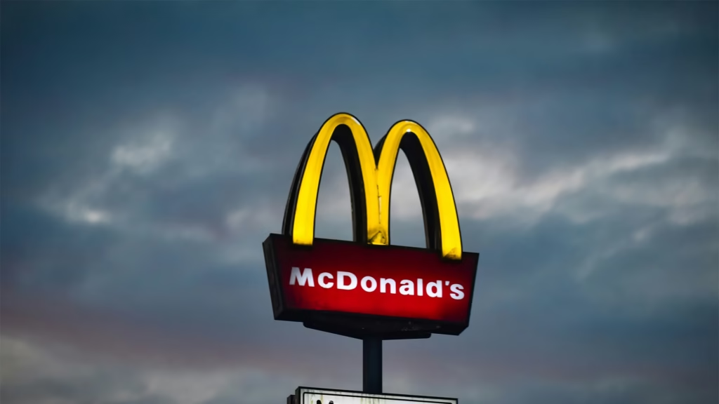
You see those golden curves from a mile away and instantly know what’s coming: quick service, familiar taste, and that unmistakable McDonald’s experience. It’s pretty remarkable when you think about it. A simple “M” shape has become one of the most recognized symbols on the planet, working its magic across every continent and culture. McDonald’s Golden Arches doesn’t need translation, explanation, or context. It just works. This isn’t luck or accident. It’s the result of smart decisions made decades ago that turned a basic architectural feature into a branding goldmine worth billions.
The Golden Arches represent one of branding’s greatest success stories, demonstrating how visual identity, when executed with consistency and strategic thinking, can transcend language, culture, and geography to create universal recognition. From New York to Tokyo, from Paris to Sydney, the yellow arches communicate instantly, proving that sometimes the most powerful symbols are also the simplest ones.
Simple Design, Massive Impact
McDonald’s Golden Arches proves that sometimes less really is more. Two golden arches forming an “M” – that’s it. No fancy graphics, no complex messaging, just pure visual simplicity that cuts through the noise. The bright yellow was chosen specifically because it pops against any background, whether you’re driving past at 70mph or scrolling through your phone at midnight.
What makes this design brilliant is how it works everywhere. While other fast food chains struggle with logos that need tweaking for different markets, McDonald’s cracked the code early. Their symbol works in New York, Bangkok, Lagos, and everywhere in between. No translation needed, no cultural adaptation required.
Design fundamentals:
- Golden curves visible from mile away: quick service, familiar taste
- Simple “M” shape: most recognized symbols on planet
- Working across every continent and culture
- No translation, explanation, or context needed
- Smart decisions decades ago
- Basic architectural feature into branding goldmine worth billions
- Two golden arches forming “M”: pure visual simplicity
- Bright yellow: pops against any background
- Driving past at 70mph or scrolling through phone at midnight
The staying power is incredible too. While brands constantly redesign their logos to stay “modern,” McDonald’s Golden Arches have barely changed since the 1960s. That consistency has built up serious brand equity over the years. Your parents recognized it, you recognize it, and your kids will too. This multi-generational recognition creates compounding value that newer brands cannot replicate quickly.
From Building Feature to Brand Icon
The Golden Arches weren’t originally designed as a logo at all. Back in the 1950s, they were actual architectural elements – massive yellow parabolas that formed part of the restaurant buildings. Picture driving down the highway and seeing these huge golden structures jutting up from the landscape. They were impossible to miss, which was exactly the point.
These physical arches served a practical purpose beyond just looking cool. They made McDonald’s restaurants instantly recognizable landmarks. Families on road trips could spot them from miles away, making McDonald’s the obvious choice for a quick meal stop. The architecture itself became advertising, a brilliant integration of form and function.
Architectural origins:
- Works in New York, Bangkok, Lagos, everywhere in between
- No translation needed, no cultural adaptation required
- Barely changed since 1960s
- Consistency building serious brand equity over years
- Multi-generational recognition
- 1950s: actual architectural elements, massive yellow parabolas
- Part of restaurant buildings
- Huge golden structures jutting up from landscape
- Impossible to miss
The Smart Evolution
Converting those building features into a simple logo was genius-level thinking. McDonald’s kept what worked, the distinctive arch shape and that eye-catching yellow, while creating something that could work on everything from billboards to burger wrappers. The simplified version maintained all the recognition value while becoming infinitely more flexible.
This evolution shows how good branding adapts without losing its core strength. McDonald’s Golden Arches today still carries the DNA of those original roadside arches, but it’s been refined into something that works in our digital world. Whether it’s a 50-foot highway sign or a tiny app icon, the impact remains the same.
The transition from physical architecture to abstract symbol represented a masterclass in brand evolution. Many companies struggle with this kind of transformation, either changing too much and losing recognition or changing too little and seeming dated. McDonald’s found the perfect balance, maintaining visual continuity while gaining unprecedented flexibility in application.
Global Recognition Without Words
McDonald’s marketing strategy has turned the Golden Arches into a universal language. In countries where people can’t read English, don’t know American culture, or have completely different food traditions, those arches still communicate clearly: fast, reliable, familiar food. That’s marketing gold that few brands ever achieve at this scale.
The emotional connection runs deep too. McDonald’s Golden Arches triggers memories of childhood Happy Meals, late-night study sessions, road trip pit stops, and countless other personal moments. These associations travel with people wherever they go, making the brand feel familiar even in foreign places. This emotional resonance transforms the logo from mere identification into a trigger for positive memories and feelings.
Universal recognition:
- Families on road trips: spotting from miles away
- Architecture itself becoming advertising
- Converting building features into simple logo: genius-level thinking
- Distinctive arch shape and eye-catching yellow
- Working on everything from billboards to burger wrappers
- Simplified version: all recognition value, infinitely more flexible
- 50-foot highway sign or tiny app icon: same impact
- Universal language across countries
- Can’t read English, don’t know American culture: still communicating clearly
The numbers back this up. McDonald’s Golden Arches consistently ranks among the top three most recognized symbols globally, competing with basic icons like religious symbols and Olympic rings. That level of recognition doesn’t happen by accident, it’s built through decades of consistent use across every possible touchpoint.
The Consistency Strategy
What makes this global recognition sustainable is unwavering consistency. Across thousands of restaurants in hundreds of countries, the Golden Arches appear the same. This consistency creates reliability in customer expectations. When travelers see those arches in an unfamiliar city or country, they know exactly what experience awaits them. That predictability has tremendous value in building global trust.
McDonald’s resisted the temptation that traps many global brands: excessive localization of core visual identity. While they adapt menus and marketing to local tastes, McDonald’s Golden Arches remain constant. This strategic choice prioritizes long-term brand equity over short-term local preferences, a gamble that has paid off spectacularly.
Cultural Impact Beyond Business
McDonald’s corporate identity has achieved something few brands ever do: it’s become part of global culture. People use McDonald’s locations as meeting points and landmarks. “Meet me at the McDonald’s near the highway” works as directions anywhere in the world. The golden arches have transcended their commercial purpose to become genuine cultural markers.
Economists actually study the “McDonald’s effect” when analyzing globalization and market penetration strategies. Business schools teach case studies about how the company used visual branding to enter new markets. McDonald’s Golden Arches have become shorthand for American business influence worldwide, showing how powerful symbols can carry meaning far beyond their original purpose.
Cultural penetration:
- Childhood Happy Meals, late-night study sessions, road trip pit stops
- Emotional connections traveling with people wherever they go
- Familiar even in foreign places
- Top three most recognized symbols globally
- Competing with religious symbols and Olympic rings
- Decades of consistent use across every touchpoint
- Locations as meeting points and landmarks
- “Meet me at McDonald’s near highway” working as directions worldwide
- Transcended commercial purpose to genuine cultural markers
The ripple effects are everywhere in the branding world. Countless companies have tried to replicate McDonald’s approach to simple, recognizable visual identity. Most fail because they’re copying the execution rather than understanding the strategy: create something so simple and memorable that it becomes impossible to forget.
The Academic Interest
Marketing professors worldwide use McDonald’s Golden Arches as the textbook example of successful global branding. The symbol appears in discussions about semiotics, brand equity valuation, and cross-cultural marketing effectiveness. This academic attention validates the strategic brilliance behind what might seem like a simple design choice, revealing layers of psychological and cultural sophistication.
The Golden Arches also feature prominently in discussions about visual language and how symbols communicate across linguistic barriers. In an increasingly globalized world, the ability to convey brand identity without words becomes more valuable, and McDonald’s demonstrated this principle before globalization became a buzzword.
The Bottom Line
McDonald’s Golden Arches represent branding at its most effective. What started as a practical architectural feature became a multi-billion dollar asset through smart, consistent application over decades. The lesson isn’t just about good logo design, it’s about understanding that great symbols work because they’re simple, visible, and emotionally connected to real experiences.
The branding masterclass:
- 1950s: architectural elements in restaurant buildings
- 1960s: barely changed since, consistency building brand equity
- Universal language: works where people can’t read English
- Economists studying “McDonald’s effect” on globalization
- Business schools: case studies on visual branding entering new markets
- Shorthand for American business influence worldwide
- Multi-billion dollar asset through smart, consistent application
For any business trying to build lasting brand recognition, the McDonald’s approach offers a clear playbook: keep it simple, make it visible, use it consistently, and give it time to build meaning in people’s lives. In a world where everyone’s fighting for attention, sometimes the most powerful move is the simplest one.
McDonald’s Golden Arches prove that when you get the fundamentals right, one symbol really can speak to the entire world. The golden curves have become more than a logo, they’re a global language of their own, communicating instantly across every barrier humans have created. That’s the ultimate achievement in branding, creating something so universally understood that it transcends its commercial origins to become part of human visual culture itself.


