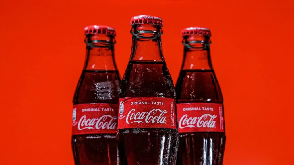
Coca-Cola is more than a soft drink, it is one of the most recognizable brands in the world. For over a century, it has kept a strong identity built on its red-and-white logo, classic typography, and signature contour bottle. While other brands have struggled to stay relevant, Coca-Cola branding has maintained consistency while finding ways to stay fresh. This balance of tradition and subtle evolution has made it a true global icon.
What sets Coca-Cola apart is how it sells more than a product. Its campaigns focus on happiness, sharing, and togetherness, turning the drink into part of life’s best moments. From family gatherings and sports events to holiday traditions, Coke has tied itself to memories rather than features. This emotional connection has helped the brand remain timeless and loved across generations. The genius lies in creating associations so strong that the brand becomes inseparable from positive human experiences.
The Power of Consistency and Simplicity
Coca-Cola’s biggest advantage has been its ability to remain consistent for more than a century. From the late 1800s to today, the brand’s red-and-white identity has stayed almost untouched. The logo, script typography, and color scheme are so iconic that they are instantly recognizable in nearly every corner of the world. This visual consistency has created a sense of trust and reliability that very few brands can claim.
While many companies have experimented with major redesigns or trend-driven rebranding, Coca-Cola branding has chosen to evolve slowly and carefully. It has introduced subtle updates over time, but the overall look has always stayed familiar. That familiarity gives the brand an edge, allowing people to recognize it instantly and associate it with refreshment and joy.
Consistency principles:
- More than soft drink: most recognizable brands in world
- 100+ years: strong identity built on red-and-white logo, classic typography, signature contour bottle
- Other brands struggling to stay relevant
- Maintained consistency while staying fresh
- Balance of tradition and subtle evolution
- Sells more than product: campaigns focusing on happiness, sharing, togetherness
- Part of life’s best moments: family gatherings, sports events, holiday traditions
- Tied to memories vs. features
Equally powerful is the simplicity of messaging. Instead of long or technical slogans, Coca-Cola branding has relied on short, memorable phrases that connect emotionally. Campaigns like “Open Happiness” or “Taste the Feeling” are easy to recall and resonate across cultures without translation barriers. This linguistic simplicity ensures the brand message travels seamlessly across borders and languages.
Visual Identity Strength
This commitment to clarity and consistency has helped Coca-Cola remain timeless. The company doesn’t just advertise a drink; it communicates an experience, an emotion, and a lifestyle. By keeping its identity simple yet powerful, Coca-Cola branding has built one of the strongest and most enduring brands in history. The contour bottle alone, unchanged in its essential form for over a century, can be recognized by touch alone in darkness, demonstrating the power of consistent design.
Selling Emotions, Not Products
What makes Coca-Cola truly timeless is that it doesn’t just sell a beverage, it sells a feeling. From the famous “I’d Like to Buy the World a Coke” campaign to the more modern “Open Happiness,” the brand has always tied itself to moments of joy, unity, and celebration. A bottle of Coke is presented not as a product on its own, but as something that elevates experiences, whether that’s a family dinner, a big sports win, or a simple afternoon with friends.
This emotional approach means Coca-Cola branding goes beyond the drink itself. Instead of highlighting ingredients or technical features, the company taps into universal human desires for happiness, connection, and belonging. By linking its product with these emotions, Coca-Cola positions itself as a companion to life’s meaningful moments rather than just a soft drink on a shelf.
Emotional strategy:
- Late 1800s to today: red-and-white identity almost untouched
- Logo, script typography, color scheme: instantly recognizable worldwide
- Visual consistency: trust and reliability very few brands claim
- Companies experimenting with major redesigns or trend-driven rebranding
- Evolved slowly and carefully: subtle updates, overall look staying familiar
- Familiarity giving edge: instant recognition, association with refreshment and joy
- Short memorable phrases: “Open Happiness” or “Taste the Feeling”
- Easy recall, resonating across cultures without translation barriers
The brilliance of this strategy is its ability to remain relevant across generations. Media channels and advertising methods have changed dramatically over the last century, but the need for joy and shared experiences has not. By continuing to tell stories rooted in emotion, Coca-Cola branding ensures it stays connected to people everywhere, regardless of time or culture. This emotional consistency creates brand loyalty that transcends rational purchasing decisions.
Universal Human Connection
The focus on emotions rather than product attributes means Coca-Cola advertising never feels dated. A 1960s Coke commercial showing families together feels as relevant today as modern ads showing friends celebrating, because the underlying human need for connection remains constant. This timeless emotional appeal gives Coca-Cola branding an evergreen quality that product-focused competitors struggle to match.
Global Identity with Local Adaptation
Coca-Cola’s identity works everywhere because it speaks a visual language that transcends borders. The bold red evokes excitement, energy, and celebration across cultures, while the flowing script logo feels approachable and timeless. The contour bottle, with its unique shape, is instantly recognized around the world as a symbol of refreshment. These consistent elements have built trust and familiarity, allowing Coke to maintain a strong presence across generations.
By keeping its core identity unchanged for more than a century, Coca-Cola branding has created a sense of reliability. No matter where you are, seeing the red-and-white logo sparks the same associations of joy and togetherness. This consistency is rare in the world of branding and has been key to Coke’s enduring global appeal.
Global-local balance:
- Communicates experience, emotion, lifestyle vs. just advertising drink
- Simple yet powerful identity
- Contour bottle: recognized by touch alone in darkness
- “I’d Like to Buy the World a Coke” to “Open Happiness”
- Tied to moments of joy, unity, celebration
- Elevates experiences: family dinner, sports win, afternoon with friends
- Taps into universal human desires: happiness, connection, belonging
- Companion to life’s meaningful moments vs. soft drink on shelf
While Coca-Cola maintains a universal brand voice, it also adapts its messaging to fit local cultures. The “Share a Coke” campaign is a perfect example. By printing popular names specific to each country, Coke made the experience personal and relevant, creating stronger connections with consumers around the world. This personalization strategy demonstrated how global brands can feel local.
Cultural Sensitivity
The brand also ties itself to events that resonate globally, such as the Olympics and FIFA World Cup, while still tailoring campaigns to reflect local traditions. This balance allows Coca-Cola branding to feel both global and personal, positioning it as a drink that celebrates unity while respecting cultural differences. Regional festivals, local celebrations, and country-specific campaigns ensure Coke feels like part of each community’s fabric.
Building a Brand Beyond the Bottle
Coca-Cola has grown far beyond its role as a soft drink to become a cultural icon. Over the decades, the brand has expanded into fashion, art, and even home décor, turning its imagery into something collectible and desirable. The logo and signature red color are seen not only in stores but also on clothing, posters, and collaborations with global fashion labels. This presence outside the bottle has cemented Coca-Cola branding as a lifestyle brand.
Part of this success comes from how the brand tells its story. Instead of focusing on the product itself, Coca-Cola branding consistently highlights people and emotions in its campaigns. Smiles, family gatherings, friendships, and celebrations take center stage, with the drink serving as the connector. This people-first approach makes Coke feel relatable across different cultures and generations.
Cultural expansion:
- Media channels and advertising changing dramatically
- Need for joy and shared experiences: constant
- Stories rooted in emotion: connected to people everywhere
- Bold red: excitement, energy, celebration across cultures
- Flowing script logo: approachable and timeless
- Contour bottle: instantly recognized worldwide as refreshment symbol
- Core identity unchanged 100+ years: reliability sense created
- Red-and-white logo: same associations of joy and togetherness
The blend of cultural relevance and emotional storytelling has allowed Coca-Cola to stay meaningful even in a crowded market. By positioning itself as more than a product, Coca-Cola branding has created a brand that feels both human and aspirational. This is why it continues to bridge generations, sparking nostalgia for older audiences while staying fresh and exciting for younger ones.
The Bottom Line
Coca-Cola’s story shows that timeless branding does not come from endless reinvention but from consistency, clarity, and the ability to adapt without losing identity. Its red-and-white design, emotional storytelling, and universal symbolism have made it more than just a soft drink. Around the world, Coke represents joy, togetherness, and celebration, turning an everyday product into a cultural icon.
The timeless formula:
- “Share a Coke”: printing popular names specific to each country
- Personal and relevant: stronger consumer connections
- Olympics and FIFA World Cup: global events
- Tailoring campaigns: reflecting local traditions
- Global and personal: celebrating unity while respecting cultural differences
- Expanded into fashion, art, home décor
- Logo and red color: clothing, posters, global fashion collaborations
- Highlights people and emotions: smiles, family, friendships, celebrations
More than a century later, Coca-Cola branding continues to inspire loyalty across generations. Its success lies in selling not only refreshment but also experiences and memories that people hold close. This balance of heritage and relevance has ensured Coke’s place as one of the most recognizable and admired brands in history, thriving even as the marketing landscape evolves.
The ultimate lesson is that truly timeless brands don’t chase trends, they create emotional territories they can own forever. Coca-Cola branding claimed happiness, sharing, and celebration as its emotional real estate, then protected that territory with unwavering consistency for over a century. This discipline, combined with just enough adaptation to stay relevant, created a brand that feels both eternal and contemporary, proving that the fundamentals of great branding never go out of style.